Why winter is the easiest motif to build
Themed binder pages are collecting by motif instead of by set — you pick a scene and hunt cards that fit it. Winter is the friendliest one to start with, for three reasons. The palette does the work: snow backgrounds sit near white, so the cards read as a single spread instead of nine unrelated rectangles. The species cluster: an entire type is built around ice, so candidates are easy to name before you start looking. And nothing on the page has to be expensive — there is no $200 chase slot the way there is on a set page. It is also the one motif with a natural life cycle. Build it in November, display it through December, retire it in January, and the rotation becomes part of the fun rather than a page you look at for three years.

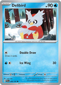
Delibird is the page
Start here. Delibird carries food in its tail — the Pokédex describes it sharing that food with people lost in the mountains — which makes it a delivery bird with a sack, and about as close as the franchise gets to Santa. It is also nearly always printed as a Common, so the most on-theme card in the entire hobby costs less than a dollar in most of its printings. Put it in the center pocket. The one exception to the cheap rule is its 2001 Neo Revelation holo, which is a genuinely expensive card these days; you do not need it, and the modern commons anchor the page just as well.
The rest of the roster
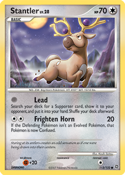
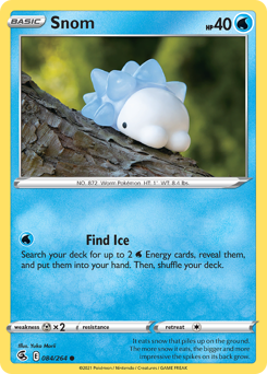
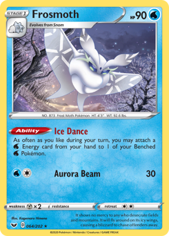
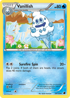
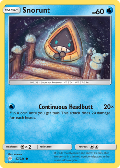
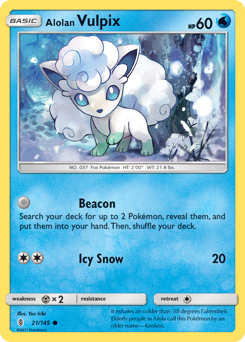
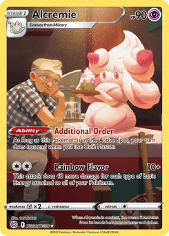
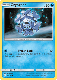
Reindeer first: Stantler, and Wyrdeer if you want the modern evolution. Then the snow lines, which is most of the page — Snorunt into Glalie and Froslass, Snover into Abomasnow, Cubchoo into Beartic, Swinub into Piloswine and Mamoswine, Snom into Frosmoth, and the Vanillite line, which is literally soft-serve ice cream. Add Alolan Vulpix and Alolan Ninetales for white, Glaceon for the Eevee crowd, Cryogonal for a snowflake with a face, Eiscue, Spheal, and Cetoddle. For red and dessert notes, Alcremie is the obvious pick. That is over thirty Pokémon before you have looked at a single card, which is why this page fills faster than any other motif.
Two rules — pick one and hold it
The strict rule: the artwork has to show snow or ice. That gives the tightest-looking page, because the backgrounds do the unifying and it keeps out studio portraits of ice-types standing in a void. The loose rule: any winter species counts regardless of what is behind it. That page fills in an evening out of commons you may already own. Both work — what does not work is switching halfway, because a page where five cards share a snowfield and four are floating on foil reads as unfinished rather than eclectic. Decide before you buy.
The layout: white on top, blue at the bottom, one red thing in the middle
Sort your nine by how light the card reads, then flow them down the page — the palest, snowiest art across the top row, mid-tones through the middle, the deep blues and dark ice along the bottom. Then put the one warm card in the center pocket, which is where the eye lands first. Delibird is the natural choice for that slot; Alcremie works too. If you would rather build around structure than color, run an evolution line down a single column — Snorunt, Glalie, Froslass reads instantly as deliberate — and fill the outer columns with singles.
Where the holiday-stamped cards fit
The closest thing to an official Christmas Pokémon card is the annual Holiday Calendar, whose eight foil cards each carry a festive stamp. Those are holiday-branded cards in the literal sense, they lean winter in their subjects, and eight of them is one short of a full page — so a calendar plus a single Delibird is a finished spread on its own. If you buy the calendar, sleeve the stamped cards as they come out of the doors rather than letting them float in the box; that is where the page comes from.
Build it as a gift
A finished themed page is a better present than a random pack, and it is cheaper than most people expect. Nine winter commons and a fresh binder land around $40 all in, and what the recipient unwraps is something you assembled rather than something you grabbed. If you are giving a binder anyway, slotting page one before you wrap it turns a supply gift into a personal one. Our gift guide covers the rest of the options at each budget.
Practical: sleeve them first
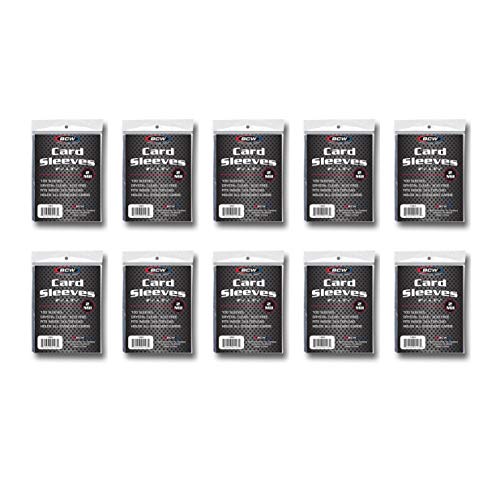
Winter art runs light, and light artwork makes edge wear and surface scuffs obvious in a way dark cards hide. Penny-sleeve everything before it goes into a page, use side-loading 9-pocket pages so nothing slides out when the binder tips, and keep the finished page out of direct sun if it is going to sit on a shelf through December. None of these cards are valuable enough to be precious about — but the whole point of a display page is that it looks good, and a scuffed white border is the first thing that ruins it.