Why beach art is a deep vein
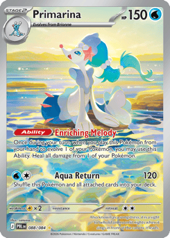
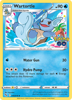
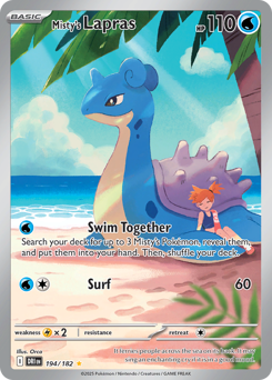
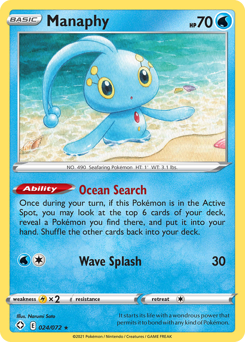
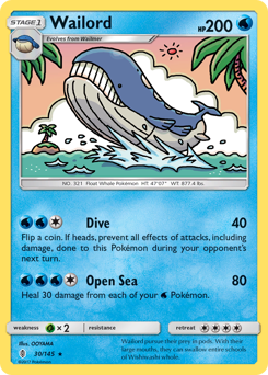
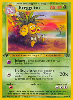
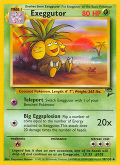
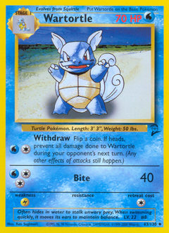
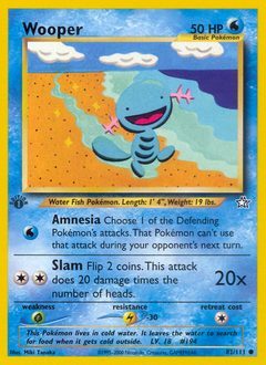
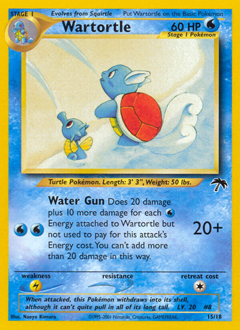
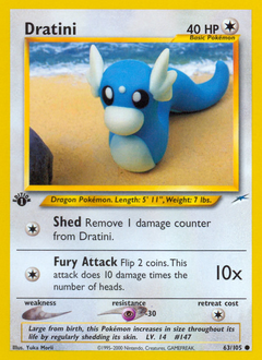
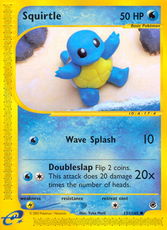
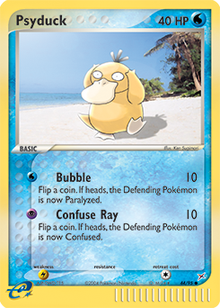
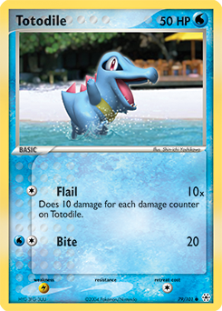
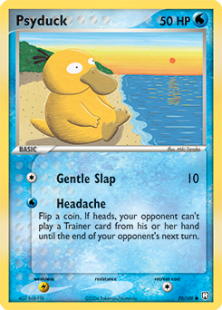
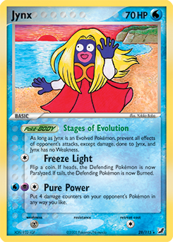
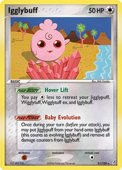
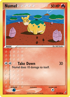
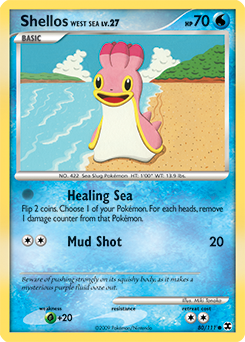
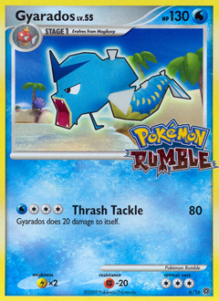
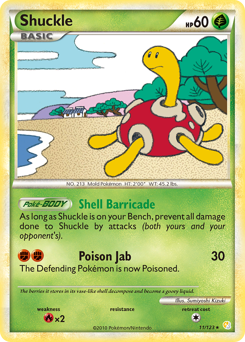
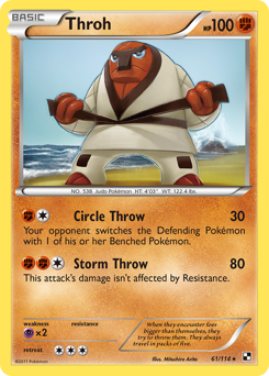
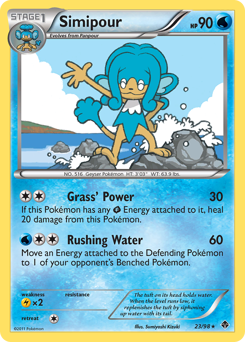
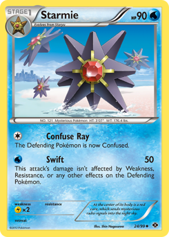
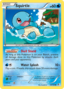
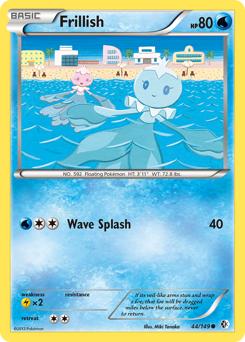
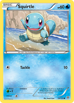
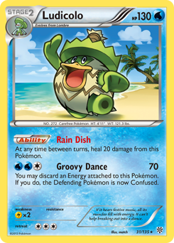
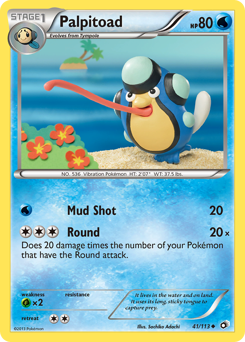
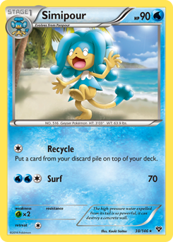
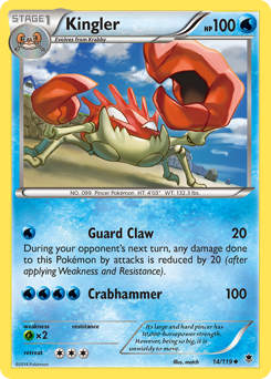
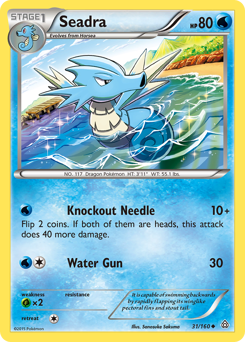
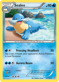
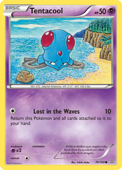
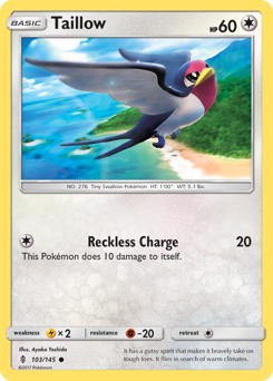
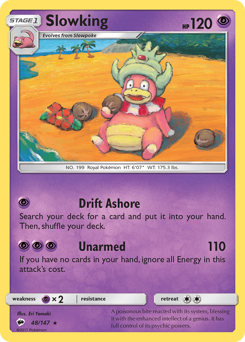
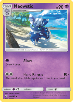
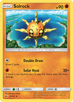
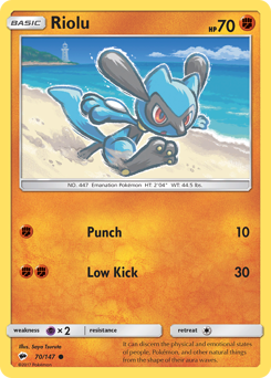
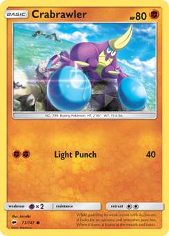
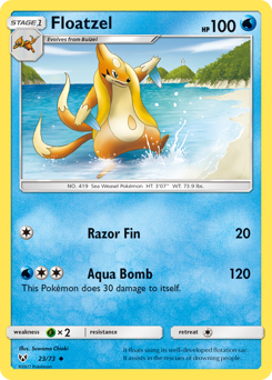
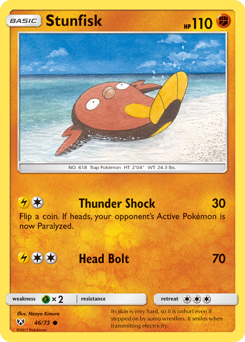
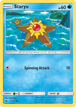
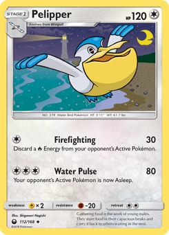
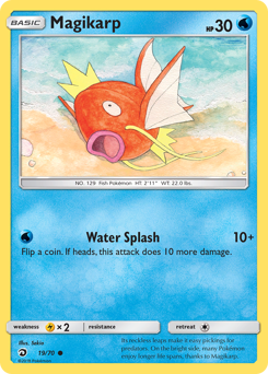
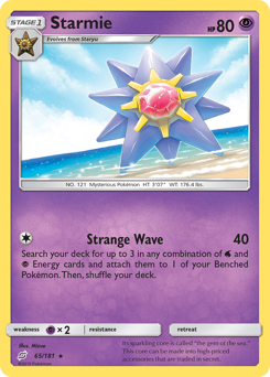
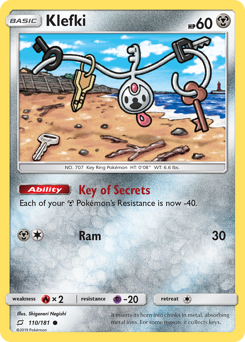
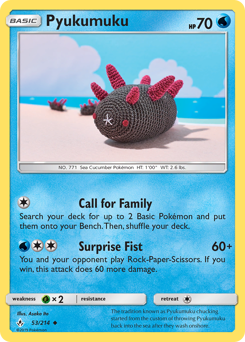
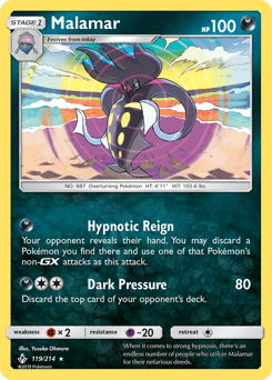
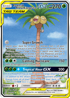
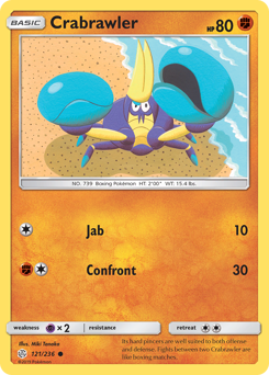
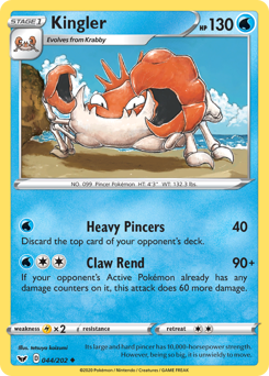
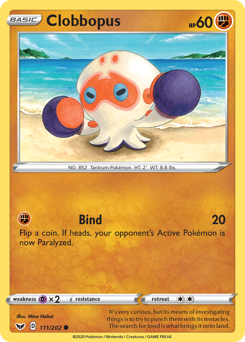
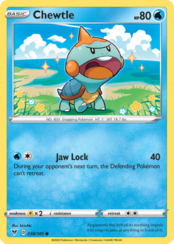
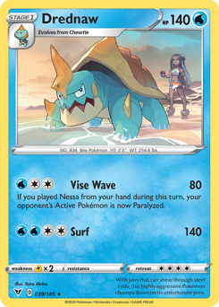
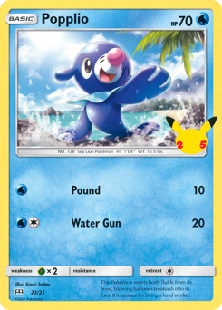
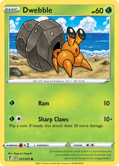
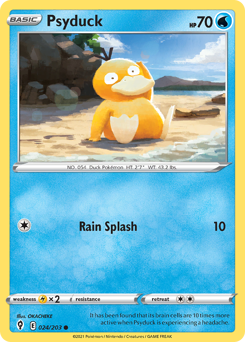
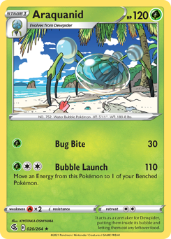
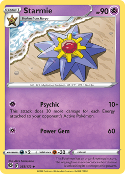
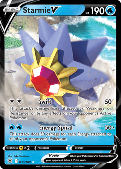
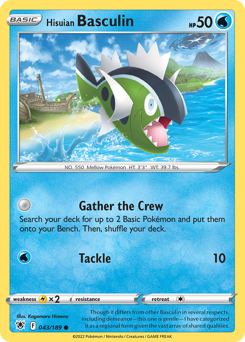
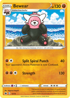
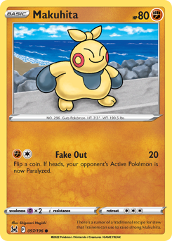
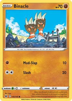
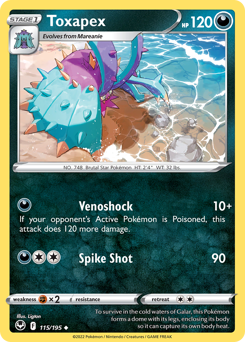
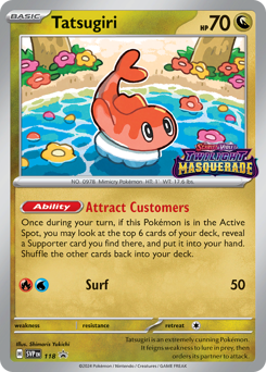
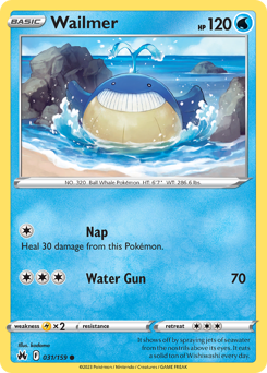
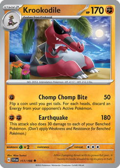
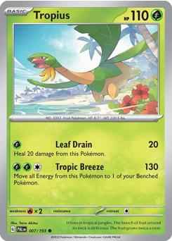
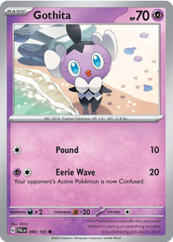
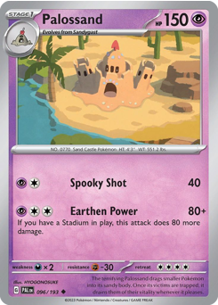
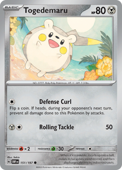
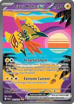
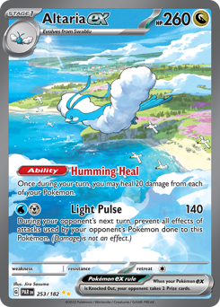
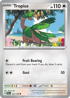
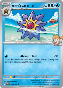
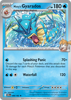
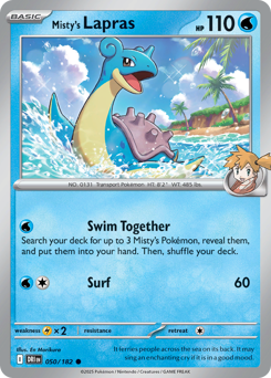
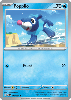
Search for "beach Pokémon" and you’ll mostly get Water-type lists. What you actually want is cards whose artwork shows the beach — and that’s a different, better hunt. Themed binder pages are collecting by motif instead of by set — you pick a scene and hunt cards whose artwork fits it. Beaches turn out to be one of the richest motifs there is, because illustrators reach for shorelines constantly. Water-type art wants somewhere for the water to meet land, so you get tide pools, wet sand, and surf again and again. And the palette does half the work for you: warm sand and cool blue water sit right next to each other, which reads beautifully across a 9-pocket grid. A finished beach page feels like a postcard rack.

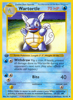
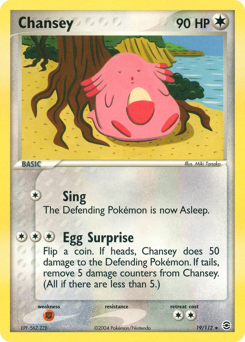
It's not only Water types
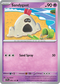
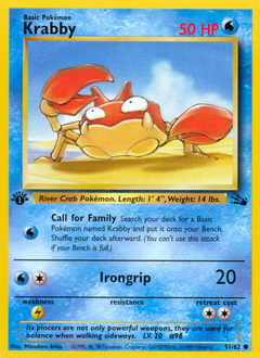
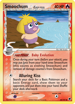
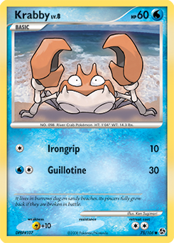
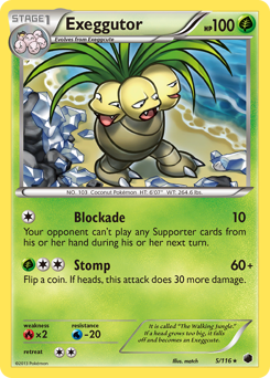
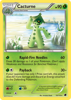
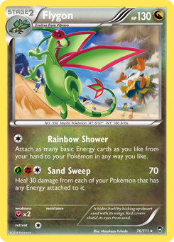
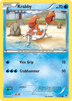
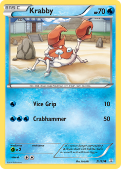
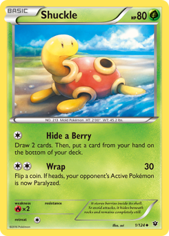
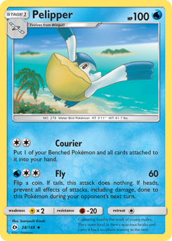
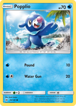
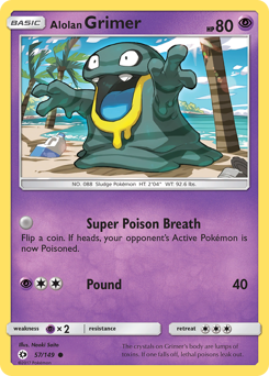
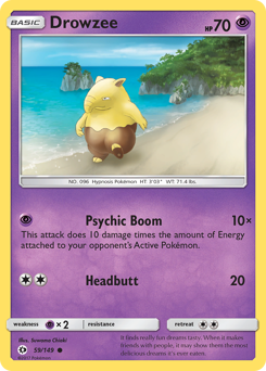
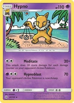
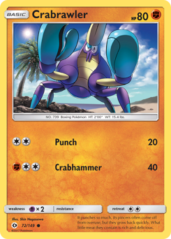
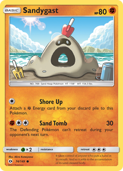
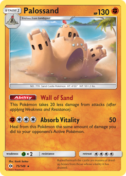
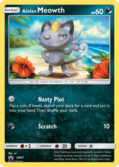
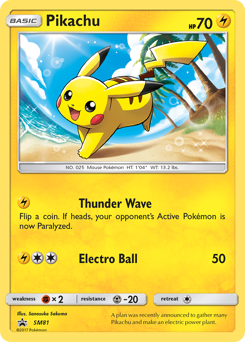
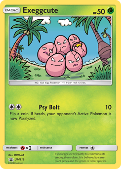
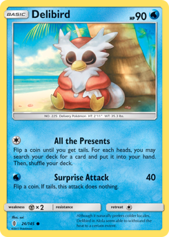
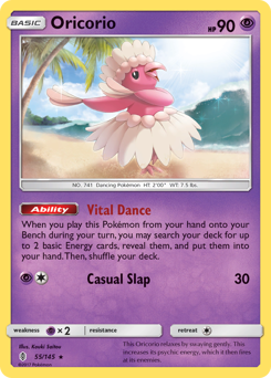
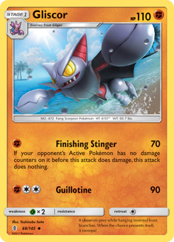
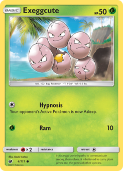
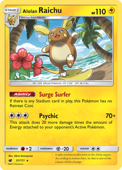
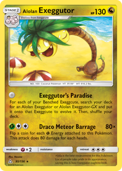
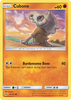
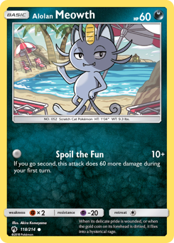
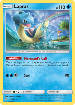
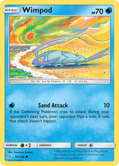
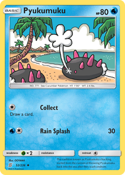
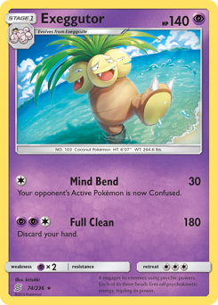
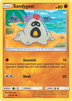
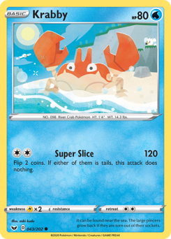
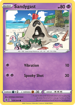
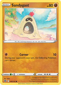
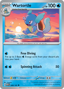
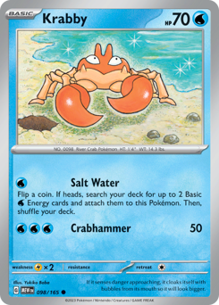
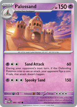
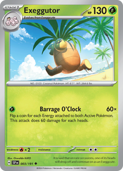
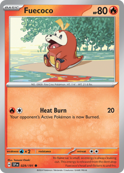
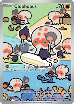
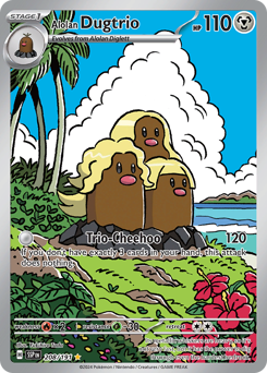
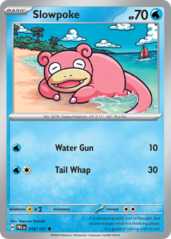
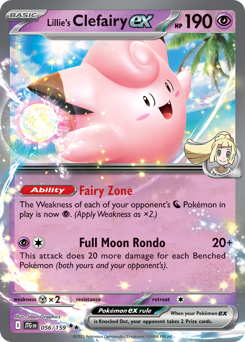
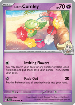
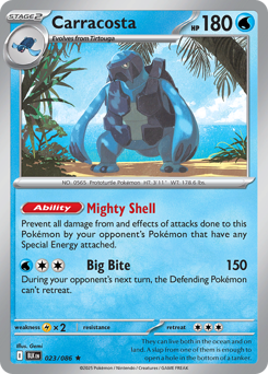
The mistake is assuming a beach page is just Water Pokémon. Plenty of the best shoreline art lives elsewhere. The truest beach Pokémon are the sand-dwellers — Sandygast, Krabby, Trapinch — who practically live there, and their cards often show dunes and dry sand rather than open ocean. Promo and special-set art loves a beach-day scene — Pokémon lounging on the shore, playing in the surf, or sharing an ice cream. Cast a wide net across types and you'll fill the page faster and with more variety than a Water-only rule allows.
The rule (and how loose to make it)
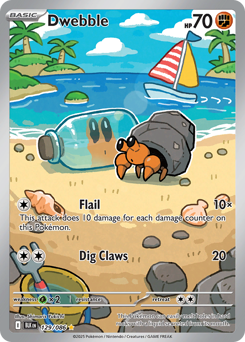
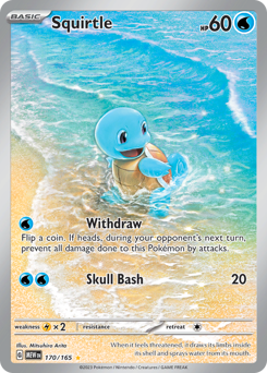
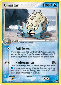
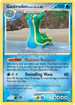
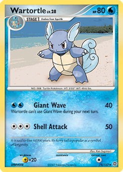
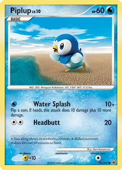
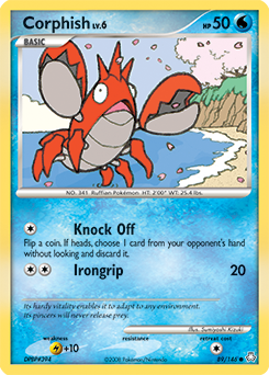
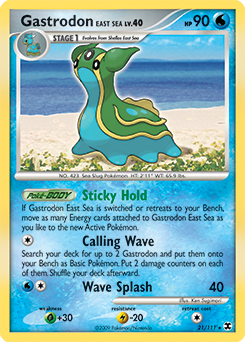
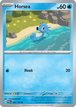
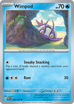
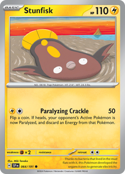
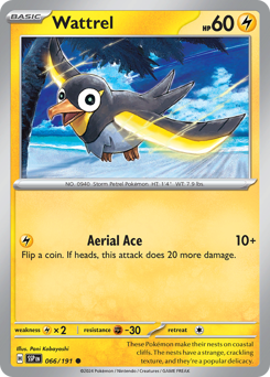
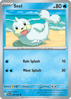
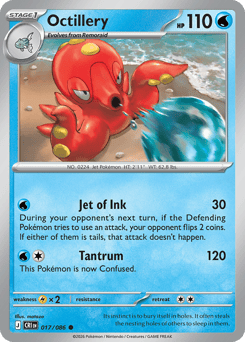
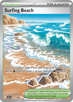
The one decision to make up front is how much shoreline you require. A strict page insists on visible sand — the Pokémon is on or beside a beach. A looser page accepts any coastline, including rocky shores, piers, and open water with a strip of land in the distance. Both work; just pick one and hold it across all nine slots so the page reads as intentional. As with any themed page, favor art that puts the Pokémon in the scene over a studio portrait with a painted-on background — the ones that look like a real day at the beach are the ones that carry the page.
Laying it out: sand to sea
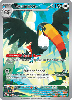
This theme has a layout trick the others don't. Sort your cards by how warm or cool their palette is, then flow them top to bottom: sandy, sun-warm scenes across the top row, mixed shoreline in the middle, deep blues and open water along the bottom. The grid ends up looking like a cross-section of the beach itself. Center a dramatic full-art as the hero and let the framed-art commons ring it — those small art windows read like a strip of polaroids around the main shot. Use clear or perfect-fit sleeves so the art stays crisp, and a side-loading page so nothing slides out.
Finding candidates (and pairing them)
Listings won't be tagged 'beach,' so you find these by looking, not searching. Browse set galleries and artist pages and scan for sand and surf in the backgrounds — once you're tuned to it, shorelines jump out everywhere. Certain illustrators return to the coast often enough that following an artist page will surface a run of candidates at once. And this is a page that wants company: it's a natural fit for the scrapbook crowd, so pair it with summer memorabilia — a ticket stub from a trip, a strip of blue washi tape, a pressed something from an actual beach day. The point of a page like this isn't set completion. It's a small, warm thing you built on purpose.