Why rain is such a rare page
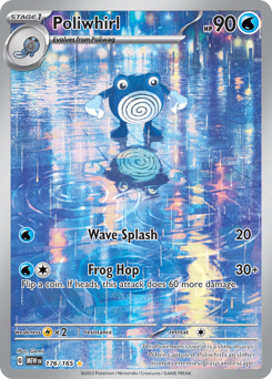
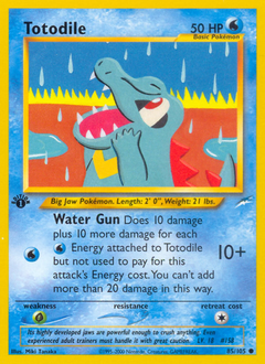
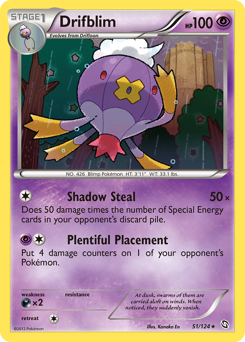
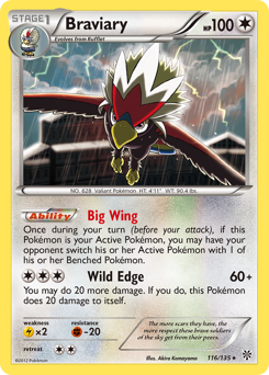
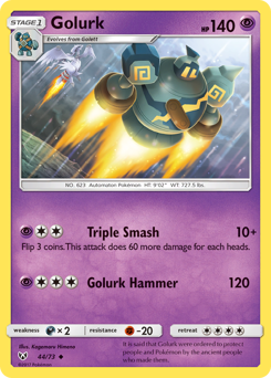
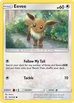
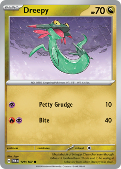
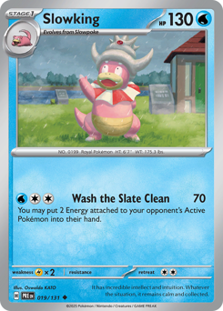
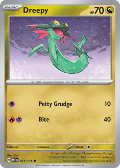
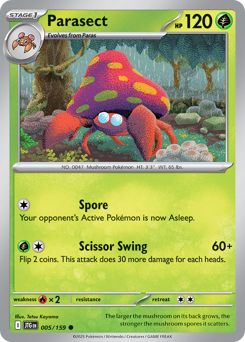
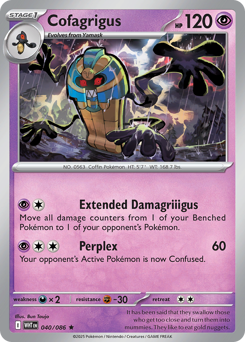
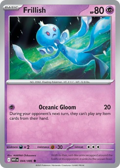
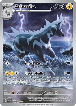
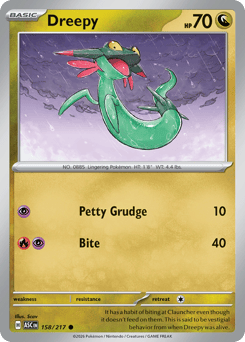
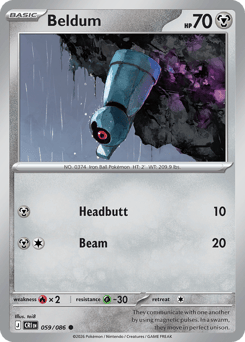
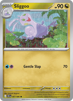
Themed binder pages are collecting by motif instead of by set — you pick a scene and hunt cards whose artwork fits it. Rain is one of the hardest motifs to fill, and that's exactly what makes it worth building. Falling rain is real work to draw: an artist has to layer streaks, dot in splashes, and get the wet reflections right, so most illustrators skip it. When someone does commit to it, the card almost always has a soaked-through atmosphere you don't get from a clear-sky background. A finished rain page reads like weather you can hear.

It's not only Water types
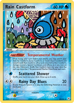
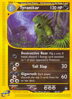
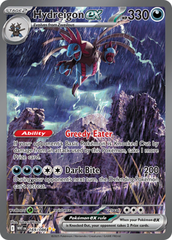
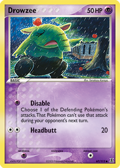
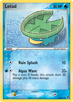
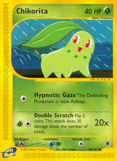
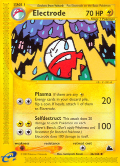
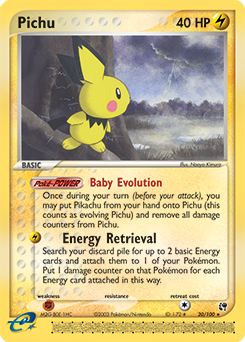
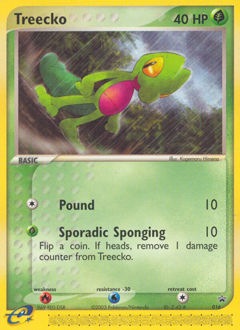
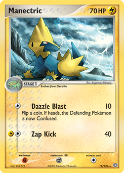
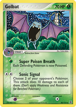
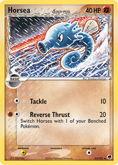
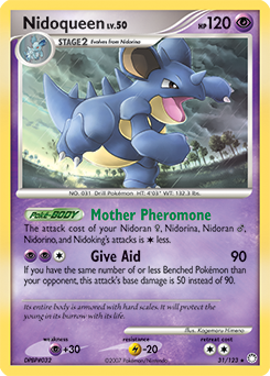
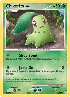
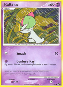
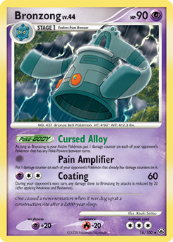
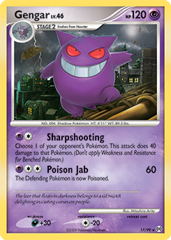
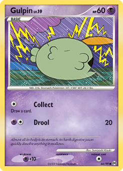
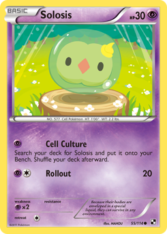
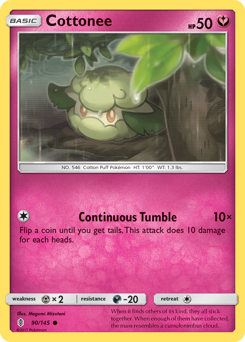
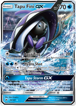
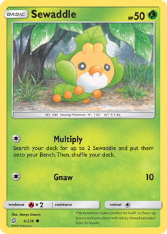
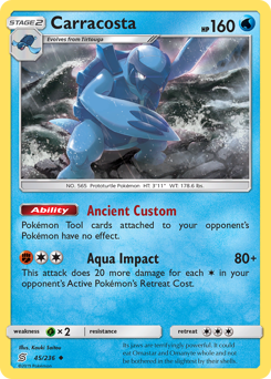
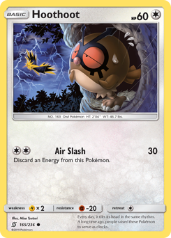
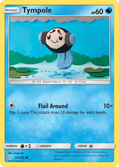
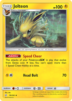
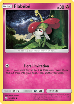
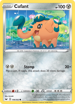
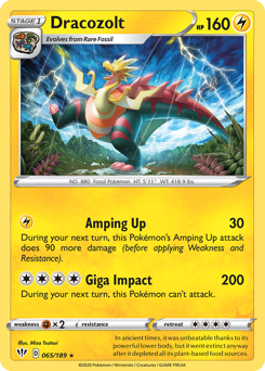
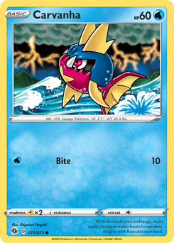
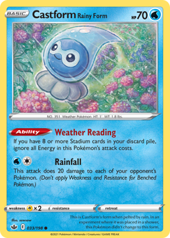
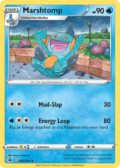
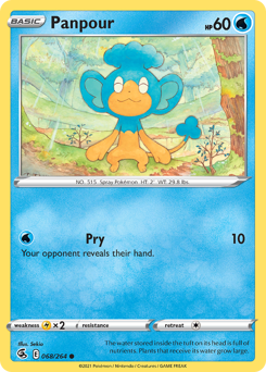
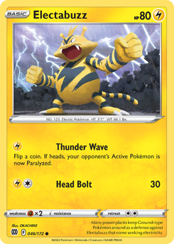
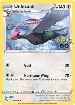
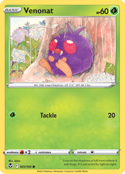
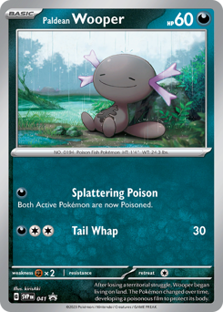
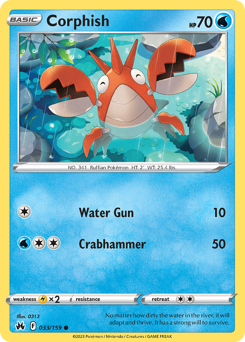
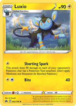
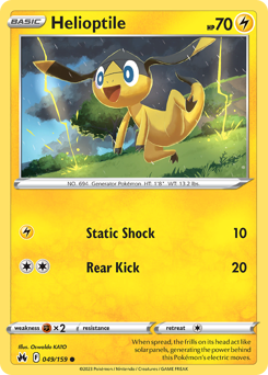
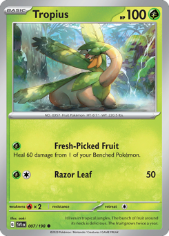
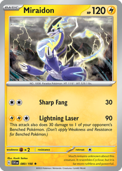
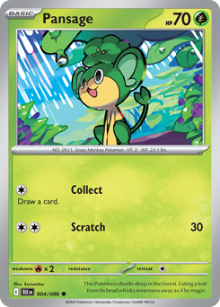
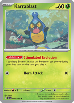
The easy assumption is that a rain page is a Water-type page, and it isn't. Rain falls on everyone. Some of the strongest rain art belongs to Grass Pokémon soaking up a downpour or Electric types crackling against a gray sky, and the contrast is half the appeal — a bright, dry-looking Pokémon standing in a storm pops harder than a Water type that blends into the wet. Castform has a whole Rain form it changes into when the weather turns, so it belongs here almost by definition. The Lotad line practically lives in ponds and puddles and fits right in too. Chase the weather, not the type, and the page fills with more variety.
The rule (and how loose to make it)
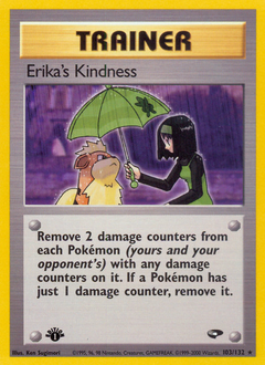
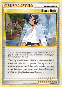
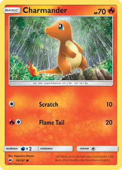
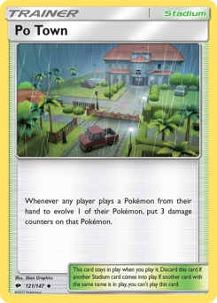
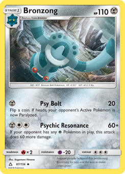
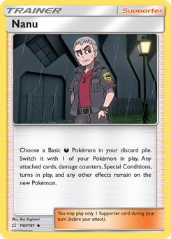
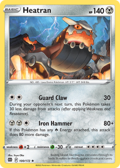
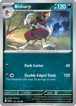
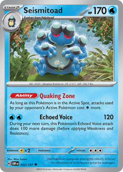
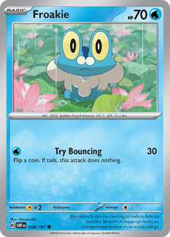
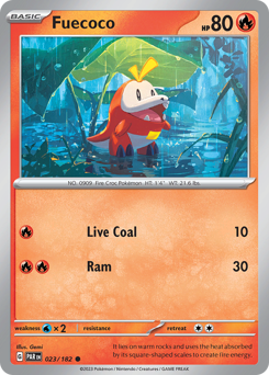
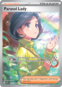
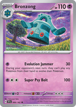
The one call to make up front is what counts as rain. A strict page insists on visible falling rain — actual streaks in the air, not just a puddle or a gray sky. A looser page accepts the whole storm: dark clouds, wet ground, a Pokémon sheltering under a leaf while it pours nearby. Both work; just pick one and hold it across all nine slots so the page reads as intentional. As always, favor art that puts the Pokémon inside the weather over a studio portrait with a stormy backdrop painted behind it — the ones that look genuinely caught in the rain are the ones that carry the page.
Laying it out: the storm front
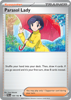
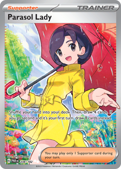
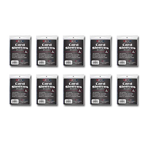
This theme has a layout trick built in. Sort your cards by how heavy the weather looks, then flow them top to bottom: light drizzle and first-drops across the top row, steady showers in the middle, the darkest full downpours along the bottom. The grid ends up moving like a storm rolling in. If you'd rather have a single hero moment, center one umbrella-or-shelter card — a Pokémon tucked out of the rain — and ring it with the wetter, wilder scenes so the calm center holds the page together. Use clear or perfect-fit sleeves so the fine streaks stay sharp, and a side-loading page so nothing slides out.
Finding candidates (and pairing them)
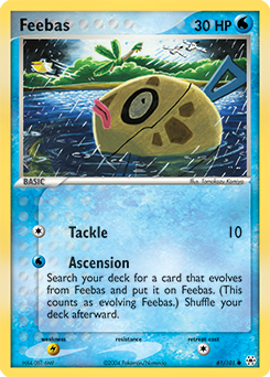
Listings won't be tagged "rain," so you find these by looking, not searching. Browse set galleries and artist pages and scan the backgrounds for streaks and wet reflections — once you're tuned to it, downpours start jumping out. The older e-Card and EX-era art is worth a slow look; that painted style handled weather with a soft, atmospheric touch that's easy to miss on a quick scroll. And this is a page that wants company, so it suits the scrapbook crowd: pair it with a strip of gray washi tape, a ticket from a rained-out day, a pressed leaf. The point of a page like this isn't set completion. It's a small, moody thing you built on purpose.